Maps and Charts
Below are maps from Chapter 3 of Equity, Growth and Community that help illustrate the metro region selection process. As detailed in the book, Benner and Pastor worked on an extensive set of data on job and earnings growth, as well as income distribution and poverty reduction data to determine which of the largest 192 regions (by population) performed well over a thirty-year period. They looked at cases where equity and growth come together to see whether an epistemic community was present, and cases where knowledge communities were reportedly present and were or were not yielding good results.
Be sure to check out Chapter 3 in the ebook for maps, data tables, data sources, and full methodology descriptions by Benner and Pastor. Wisit the Data page to explore and download data for all the regions.
Visit this page again soon as we continue to add more charts, data visuals, and perhaps an infographic or two!
U.S. Metro Regions by Growth and Equity Indices, 1980 – 2010s
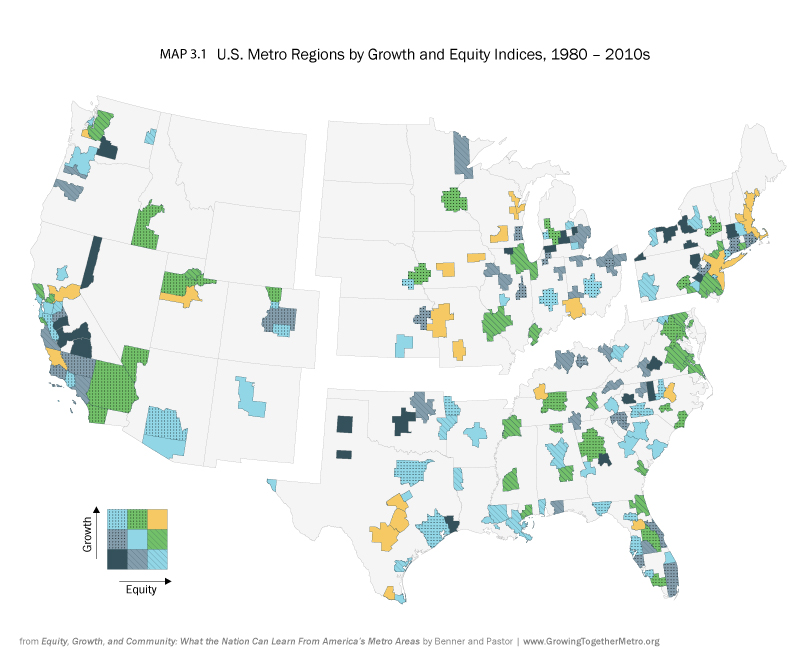
Learn all about this map, data sources, and methodology details in Chapter 3.
U.S. Metro Regions Scoring in Top Three Squares in Both Over-time and Endpoint Measure of Growth and Equity
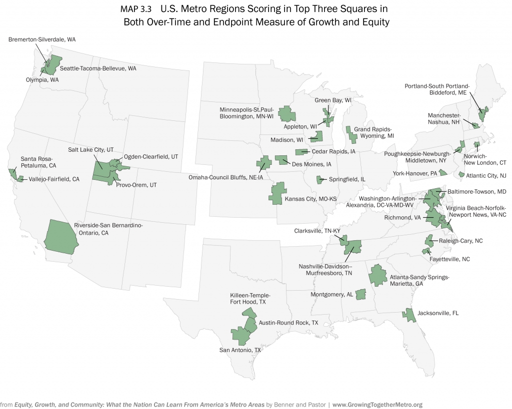
Learn all about this map, data sources, and methodology details in Chapter 3.